Experience and working with the AEM Grid
Adding and positioning components in a responsive grid

"A good web designer must be able to make Internet sites appealing."
… We all know that this is no longer true. After all, when designing the user experience, he or she has to keep an eye on all the details of mobile Internet use in order to offer a perfect customer experience on every device.
In today's world, where an end user can view the web on a smartphone, tablet or desktop, they must be fully proficient in Responsive Web Design. This means that content and navigation elements, as well as the structural design of the layout grid of a website, can be adapted to the variety of screen resolutions to be used.
In every imaginable view, images or texts should be precisely placed in the layout grid and elements of the website should fit harmoniously into the design grid.
It should be possible to maintain text components with different text lengths. You should be able to reproduce ad specs with different focus points and cuts in screen components. This represents an immense challenge in the planning and conception phase and it is often not possible for a designer to keep track of the multitude of variations.
Therefore it would be a nice solution if the author, who is responsible for the content of the components, could choose the width (i.e. the number of design grid columns) individually depending on the content? Or would it?
Adobe Experience Manager (AEM) offers from version AEM 6.3 on an enormous facilitation for the creation of a responsive layout. This is because the author, who is responsible for page maintenance, can add and position components in a responsive grid.
This is done with the freely usable Layout-Container which uses predefined breakpoints and thus allows components to be aligned and placed horizontally on a grid.
Using the so-called layout mode, the editor can freely define which behaviour of the content should take place in which viewport (should blocks of text appear below each other in the smartphone view, but flow around them in a desktop view).
How does the Responsive Grid work?
First of all, it behaves like a normal Parsys (paragraph system), although it does not differ externally either. The placeholder "Drag components here" appears and the author can drag the components into the layout container, which contain the actual content.

Let's take a look behind the scenes. Because if we look at the implementation at this point, we see that it is only an extension of the traditional paragraph system.
If the author places a text component in the layout container, he or she has an additional option to adjust the text in the dynamic responsive layout.
< sly data-sly-resource="${'parsys' @ resourceType='wcm/foundation/components/parsys'}"/>

< sly data-sly-resource="${'responsivegrid' @ resourceType='wcm/foundation/components/responsivegrid'}"/>
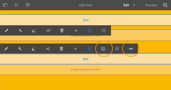
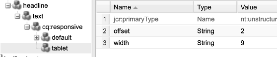
An author now has the option to specify the number of grid columns for the nested layout container.
For this purpose, there is a "Layout" sign in the toolbar (far right in the figure) to make this change depending on the content of the component and to be able to set the layout container to any width and position.
The grid defined by the designer can now be placed according to the author's needs for the desired component without affecting the coherence, order or character of the layout.
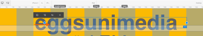
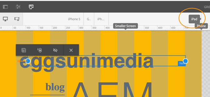
In combination with the AEM emulator, the author can view the page content adapted to the simulated user interface and edit it separately. By default, the AEM grid uses three breakpoints for a 12-column grid.
The desired positioning of the component can be adapted to the respective viewport. For example, if the author clicks on the "iPad" sign in the emulator bar, he can edit this displayed area (up to 768px) separately. The corresponding adjustments are then only saved for this viewport. The dotted blue line in figure 4 represents the "fold" for the selected iPad.
Conclusion:
With the help of the AEM Grid, the author has become more flexible and can adapt the layout to his needs without making the design of the website inconsistent.
The author can therefore place his texts and images more freely and is no longer dependent on the location of the respective component - because content is king as we all know.
Previous problems that content suffers when static components do not offer the right place are now a thing of the past.
Technical setup:
You are welcome to request a Schulung for you and your team in our company or at your site to expand your technical AEM know-how.
In order to be able to use the AEM Grid, only a few steps are required in development:
- In your project, navigate to the component that will be rendered at the desired location on the page. Here you can insert the component "Responsive-Grid" with a data-sly-resource and the corresponding path, as mentioned earlier in the text:
< sly data-sly-resource="${'responsivegrid' @ resourceType='wcm/foundation/components/responsivegrid'}"/>
- To create the AEM Responsive Emulator, you need the "config" folder in the project to create a new configuration. In this folder a node of the type sling:OsgiConfig is now needed, which has the name of the Persistent Identity (PID) of the emulator service to be able to configure it. Please make sure to create an "alias", i.e. a unique name after the configuration name. (e.g. -eggs).
Name
com.day.cq.wcm.mobile.core.impl.MobileEmulatorProvider-eggs
jcr
sling:OsgiConfig
mobile.resourceTypes
eggsproject/components/pages/gridPage (String)
The mobile resourceTypes property represents the path of your page component to be rendered.
You must also make adjustments in the content area:
- The following property (in the jcr:content node) is required on your corresponding page:
cq:deviceGroups
/etc/mobile/groups/responsive (String[ ] )
The dynamic responsive layout is enabled. The "Emulator" icon is now visible on your created web page.
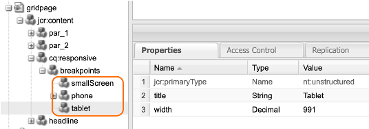
- To define the breakpoints, create the following node in the jcr:content node
Cq:responsive
nt:unstructured
- And under this again following node:
breakpoints
nt:unstructured
- You can create any number of viewports under the node. Each definition is a single node with the following properties:
[name]
nt:unstructured
Width
Maximale Breite des Devices (Decimal)
for example: